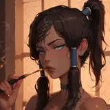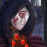
The sketchy style of House of Gentians doesn’t go well with fonts I think, that’s why I always write the text myself. Just like the art, it feels more “raw”, more close to the hand of the artist.
But looking at the pages I can’t help but think that it doesn’t look that good, because the text appearance is not consistent and overall it doesn’t look that professional. It also takes a lot of time to write and style each word.
This is why I decided to make my own font, to make it more uniform and beautiful, but at the same time keep the artist essence in it 🙈